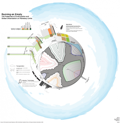
Been looking at data visualization projects. Many present an interesting intersection between Art Politics and Technology. Moreover, its they create an new perspective to talk about and see aspects of the world we live in.
Here is an example of one such project:
“In recent years, as the U.S. prison population has soared, million-dollar blocks have popped up in cities across the country. Maps of prison spending (like the one on the left) suggest a new way of looking at this phenomenon, illustrating the oft ignored reality that most prisoners come from just a handfulof urban neighborhoods. These maps invite numerous questions: How is the community benefiting from all the money being spent? And might there be another, better way to spend those same criminal-justice dollars?”
Link to Project
For inspiration:
http://www.visualizing.org/
“We created Visualizing.org because we want to help connect the proliferation of public data… with a community that can help us understand this data… with the general public.”


